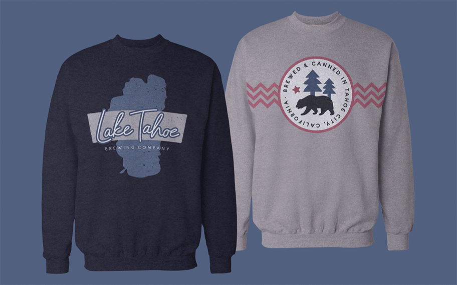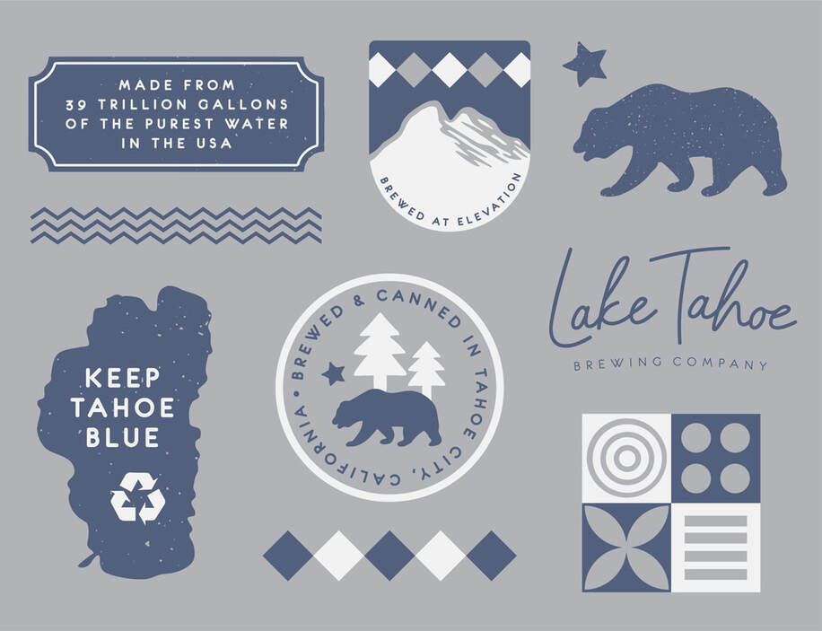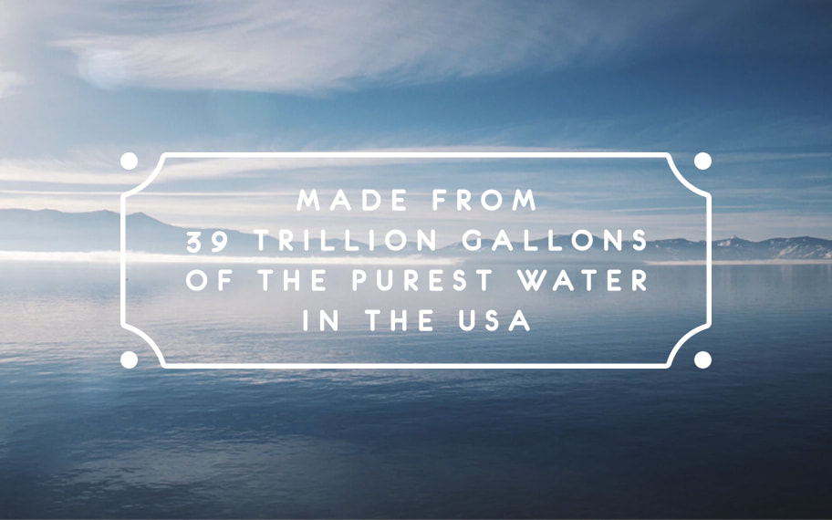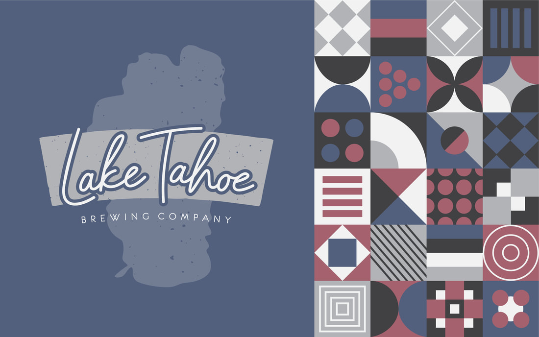
Lake Tahoe Brewing Company
Logo Design, Brand Identity, Collateral Design
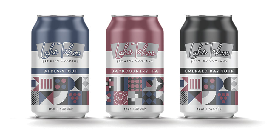
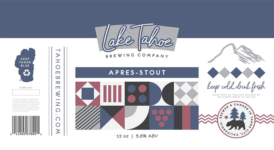
This self-initiated brand concept was aimed to embody what everyone loves about taking a long weekend trip to Lake Tahoe — the picturesque mountains, the pure fresh water, and the second-to-none ski culture. That being said, the brand also appeals to locals by not being too flashy or over-commercialized (after all, Keep Tahoe Few — errr, Blue).
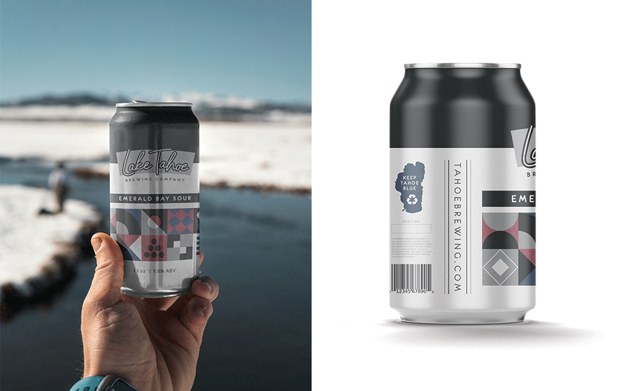
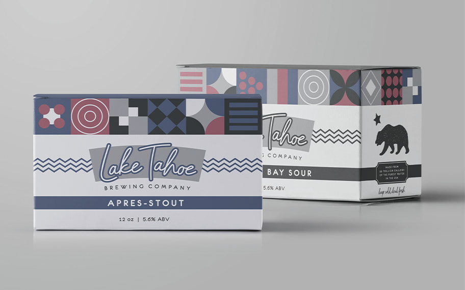
The conspicuous geometric pattern evokes the spirit of a cozy, crocheted winter sweater, and helps the packaging stand out when placed on a crowded shelf full of ostentatious craft beer labels. And while the brand is natural fit for the aprés-ski market, it aims to amass year-round appeal, as these beers are intended to be enjoyed in the summer months, too (while on a boat floating in the middle of Emerald Bay, perhaps?)
The conspicuous geometric pattern evokes the spirit of a cozy, crocheted winter sweater, and helps the packaging stand out when placed on a crowded shelf full of ostentatious craft beer labels. And while the brand is natural fit for the aprés-ski market, it aims to amass year-round appeal, as these beers are intended to be enjoyed in the summer months, too (while on a boat floating in the middle of Emerald Bay, perhaps?)