Shoyou Sushi
Logo Design, Brand Identity, Collateral Design
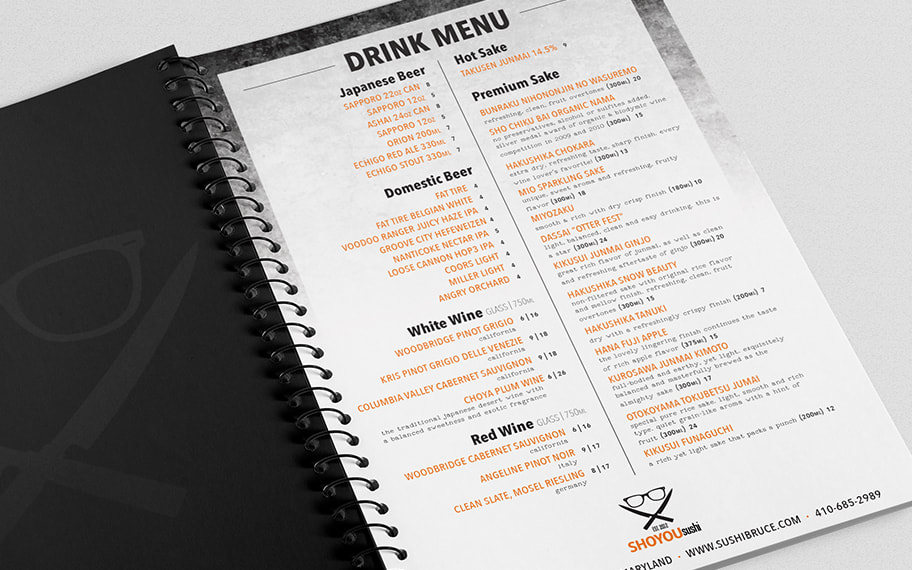
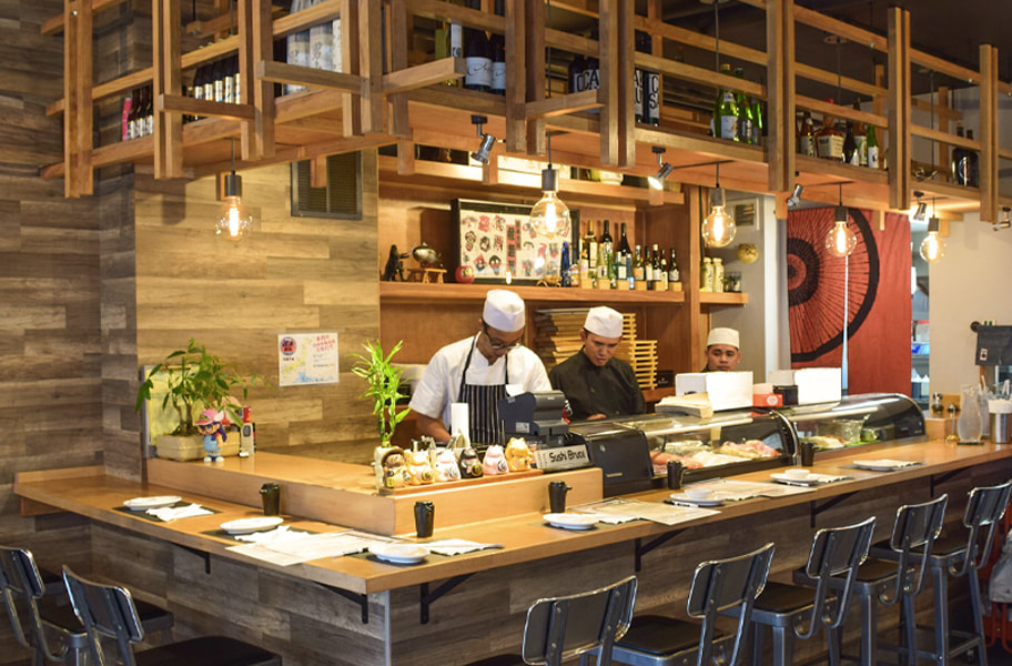
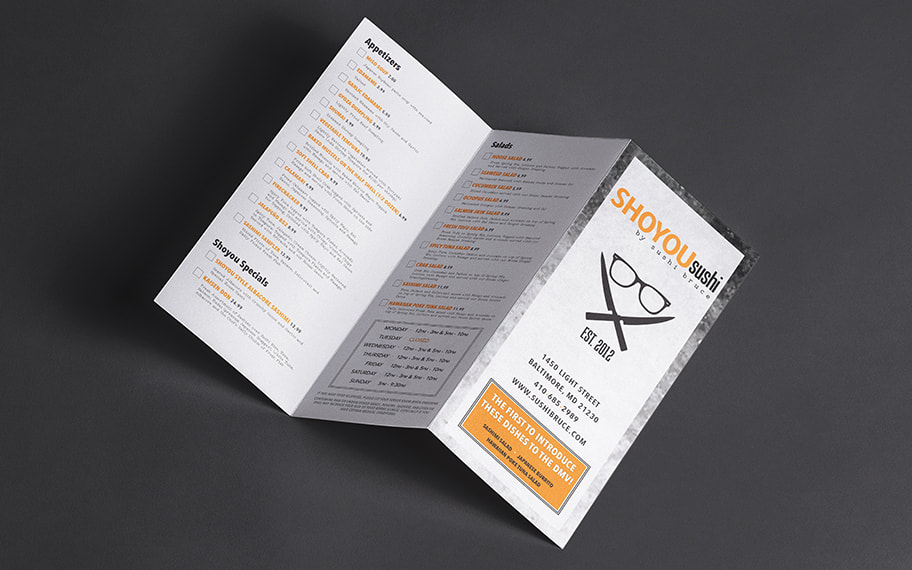
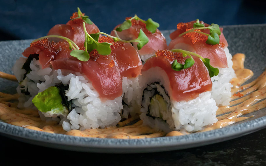
Ask anyone in Baltimore where to get the best sushi, and they'll likely point you towards 1450 Light Street in Federal Hill. With a menu packed full of fresh sashimi, mouth-watering maki, and over two dozen specialty rolls, Shoyou Sushi is a culinary Mecca in Charm City. In 2018, Shoyou moved to a new and improved location, providing the perfect opportunity to revamp the restaurant's logo, menu and entire suite of marketing collateral.
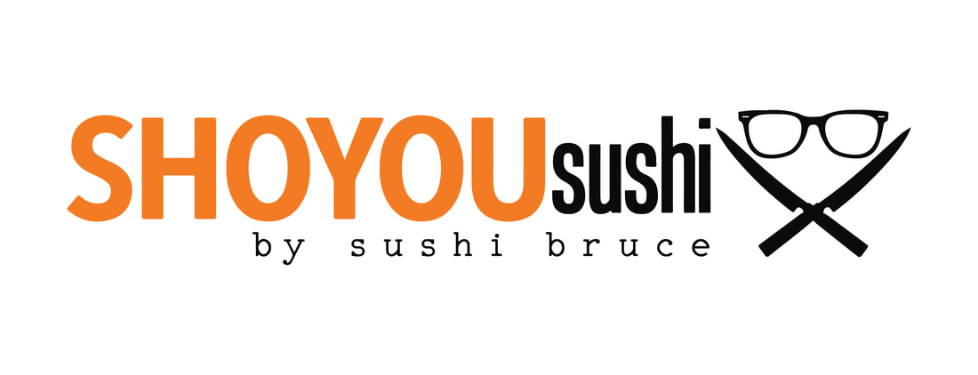
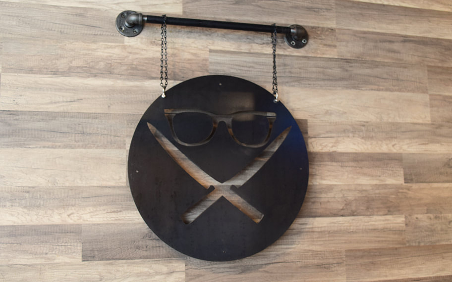
Shoyou's new logo offers a nod to head chef and local legend "Sushi Bruce" who, while famous for his culinary skills, is more often recognized by his glasses. The grungy carbon background contrasted with the striking orange represents Shoyou's small-but-mighty persona, and pairs perfectly with the dimensional steel signage and decor inside their new location.
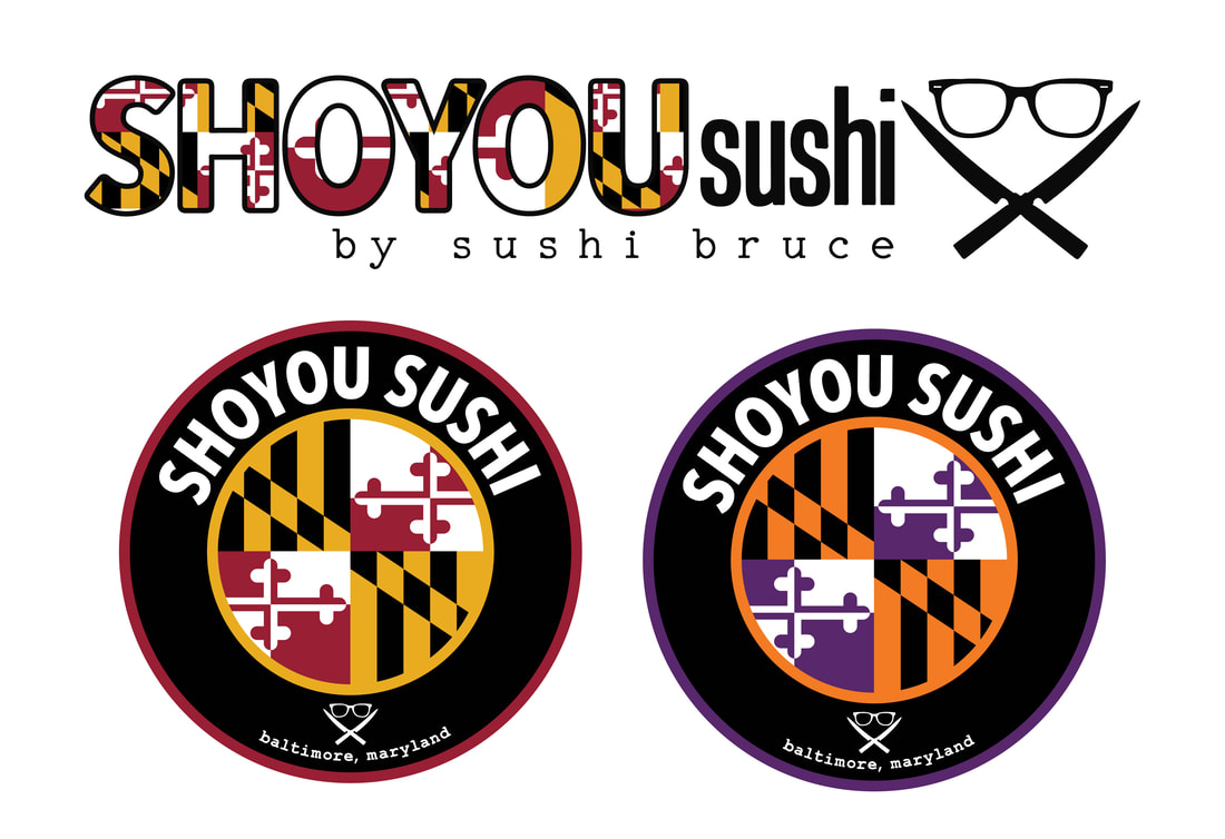
In 2021, Sushi Bruce wanted to show off his Maryland Pride with a special edition logo and badge that paraded the iconic and beloved Maryland flag pattern. As a diehard Orioles and Ravens fan who treats Baltimore as my adopted home, this was an especially fun branding project to work on.
